- Published on
How to Personalize Your Chatbot UI to Match Your Brand Colors
- Authors

- Name
- Jai
- @jkntji
You can personalize your chatbot’s interface to fit your brand colors. In this guide, we’ll walk through how to match your chat window, message bubbles, buttons and fonts to your brand palette so the chatbot feels like a natural part of your website. A well-designed chatbot not only improves user experience but also aligns closely with your brand, driving conversions and customer satisfaction.
Whether you're just getting started or looking to refine your existing chatbot window design, we'll cover essential customization techniques: from choosing the best embed type to aligning visual elements such as colors, fonts, and message bubble shapes.
Haven't created your chatbot yet? Check out this guide to get started. If you've already set up, let's dive in!
Can I personalize a chatbot’s interface to fit our brand colors?
Yes, here's what you can customize to make the chat experience feel native to your site:
- Background
- Bubbles
- Fonts
- Input
- Avatar
The rest of this guide walks through exactly how to do each step.
What is a Chatbot UI?
A Chatbot UI (User Interface) is the visual and interactive component that users engage with while conversing with a chatbot. It serves as the bridge between the user and the chatbot's underlying logic, making the conversation intuitive and accessible. Here's a detailed breakdown of its key aspects:
Core Elements of a Chatbot UI:
Chat Window:
- The main interface where the conversation occurs. This should be styled using your brand palette to match your brand colors.
- Typically includes a scrollable message area for viewing the chat history.
Input Field:
- Where users type their messages or commands.
- Often equipped with features like autosuggestions and emojis.
Send Button:
- A button to send the message, often accompanied by the "Enter" key functionality.
Message Bubbles:
- Distinct visual containers for user and bot messages.
- Often styled differently for user and bot to differentiate the speaker. And this is where you can bring in your brand colors to keep the conversation visually on-brand.
The Importance of UI in Chatbot Experience
The design of your chatbot UI significantly impacts how users interact with and perceive your chatbot. A well-designed UI can:
Enhance User Engagement: An intuitive and visually appealing interface encourages users to interact with your chatbot more frequently and for longer periods.
Reinforce Brand Identity: Consistent use of your brand colors, fonts, and design elements helps create a cohesive brand experience across all touchpoints.
Improve Usability: A clean, well-organized UI makes it easier for users to understand how to interact with the chatbot, reducing frustration and abandoned conversations.
Increase Conversion Rates: For business-focused chatbots, a professional and responsive UI can help guide users toward conversion goals, whether that's making a purchase, signing up for a newsletter, or contacting sales.
Build Trust: A polished, professional interface signals to users that your chatbot is reliable and trustworthy, making them more likely to share information and follow its recommendations.
Customizing the Chatbot UI
When customizing your chatbot UI, you'll need to make decisions about two fundamental aspects: the embed type (how the chatbot appears and is accessed on your website) and the visual styling (colors, fonts, shapes, and other design elements).
How Widget Types Influence User Experience
The type of widget you choose fundamentally shapes how users discover, access, and interact with your chatbot. Each embed type creates a different user experience:
Standard Embed: By integrating the chatbot directly into your webpage layout, you make it an integral part of the user journey. This approach works well when the chatbot is a primary feature of the page or when you want users to engage with it as part of a guided experience. The standard embed gives you the most control over placement and sizing, allowing you to make the chatbot as prominent or subtle as needed.
Bubble Embed: The floating bubble is less intrusive than a standard embed but remains easily accessible. This approach balances visibility with discretion, making it ideal for providing support or additional information without interrupting the user's browsing experience. The bubble serves as a persistent reminder that help is available when needed.
Popup Embed: By appearing after a specified delay, the popup embed actively seeks user engagement. This approach is more assertive than the other options and works well for proactive customer service or lead generation. The timing of the popup is crucial – too soon can feel intrusive, while too late might miss the opportunity to assist.
Topic Button Embed: By integrating specific topic buttons throughout your site, you allow users to initiate relevant conversations based on the content they're currently viewing. This contextual approach helps users get precise information without navigating through general conversation flows first.
When selecting an embed type, consider your specific goals:
- Do you want the chatbot to be a central feature or a supplementary tool?
- Should it be always visible or available on demand?
- Will it be used primarily for support, sales, or information?
- How does it fit into the overall user journey on your website?
The Role of Visual Elements in Chatbot Effectiveness
Once you've chosen an embed type, the visual styling of your chatbot becomes crucial for both usability and brand consistency. Each customization element serves a specific purpose:
Colors: Beyond brand alignment, colors influence user perception and behavior. For example, contrasting colors for user and AI messages improve readability, while button colors can affect click-through rates. Strategic use of color can guide user attention to important elements like the input field or call-to-action buttons.
Fonts: Typography affects both readability and perceived personality. A clean sans-serif font might convey modernity and efficiency, while a serif font might suggest tradition and trustworthiness. Font size and weight can emphasize important information and improve accessibility for users with visual impairments.
Shapes and Roundness: The roundness of UI elements like message bubbles and buttons affects the overall feel of the interface. Rounded corners often feel more friendly and approachable, while sharp corners can convey precision and formality. Consistent use of shape throughout the UI creates visual harmony.
Avatars: Custom avatars personify your chatbot, giving it a visual identity that users can connect with. Whether you use a human-like character, a mascot, or a simple logo, the avatar becomes the "face" of your AI assistant and can significantly impact how users perceive its personality and capabilities.
Background: The chat background sets the stage for the conversation. A clean, minimal background keeps the focus on the conversation, while a branded or textured background can reinforce your visual identity. For specialized applications like the WhatsApp-style example, the background can help users feel at home in a familiar-looking interface.
Selecting an Embed Type
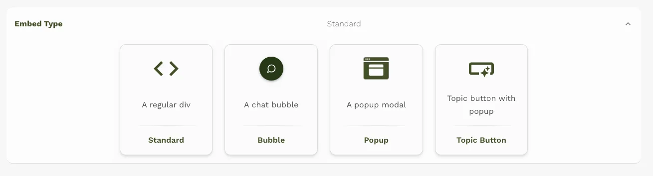
Standard Embed:
- Description: This embed type provides a full chat interface that can be integrated into a webpage. It is typically used when you want a dedicated chat area within your site.
- Appearance: It appears as a rectangular chat window that can be styled to match your website's design. You can customize its width and height to fit your layout.
- Example Code:
<script type="module">
  Agent.initStandard({
   ...
   style={{ width: '100%', height: '100%' }}
  });
</script>
You can read our documentation on the Standard widget here.
Bubble Embed:
- Description: This embed type is a floating chat bubble that appears at the bottom of the webpage. It is often used for quick access to the chatbot without taking up too much space.
- Appearance: The bubble is typically small and circular, with a customizable icon or text. When clicked, it expands into a chat interface.
- Placement: Can be positioned at the bottom-right or bottom-left corner of the screen.
- Example Code:
<script type="module">
  Agent.initBubble({
    ...
    theme: { placement: 'left' },
  });
</script>
You can read our documentation on the Bubble widget here.
Popup Embed:
- Description: This embed type opens a chat window as a popup. It can be configured to appear automatically after a certain delay.
- Appearance: The popup is a modal window that overlays the rest of the webpage, focusing user attention on the chat.
- Example Code:
<script type="module">
  Agent.initPopup({
     ...
    autoShowDelay: 3000,
  });
</script>
You can read our documentation on the Popup widget here.
Topic Button Embed:
- Description: This embed type allows you to integrate topic buttons that trigger specific topics or actions within the chatbot. The topics would be added in the "Settings" tab. The buttons are idenitifed by their
id. You can add as many topics and buttons as you need - Appearance: These are customizable buttons that can be styled to fit your website's design.
- Example Code:
<script type="module">
  Agent.initPopup({
    ...
  });
</script>
<ai-button id="1">Button For Topic #1</ai-button>
<ai-button id="2">Button For Topic #2</ai-button>
- Description: This embed type allows you to integrate topic buttons that trigger specific topics or actions within the chatbot. The topics would be added in the "Settings" tab. The buttons are idenitifed by their
You can read our documentation on the Topic Buttons widget here.
Each embed type offers flexibility in terms of customization and integration, allowing you to choose the best fit for your website's user experience.
Customizing the Colors, Fonts & Shapes
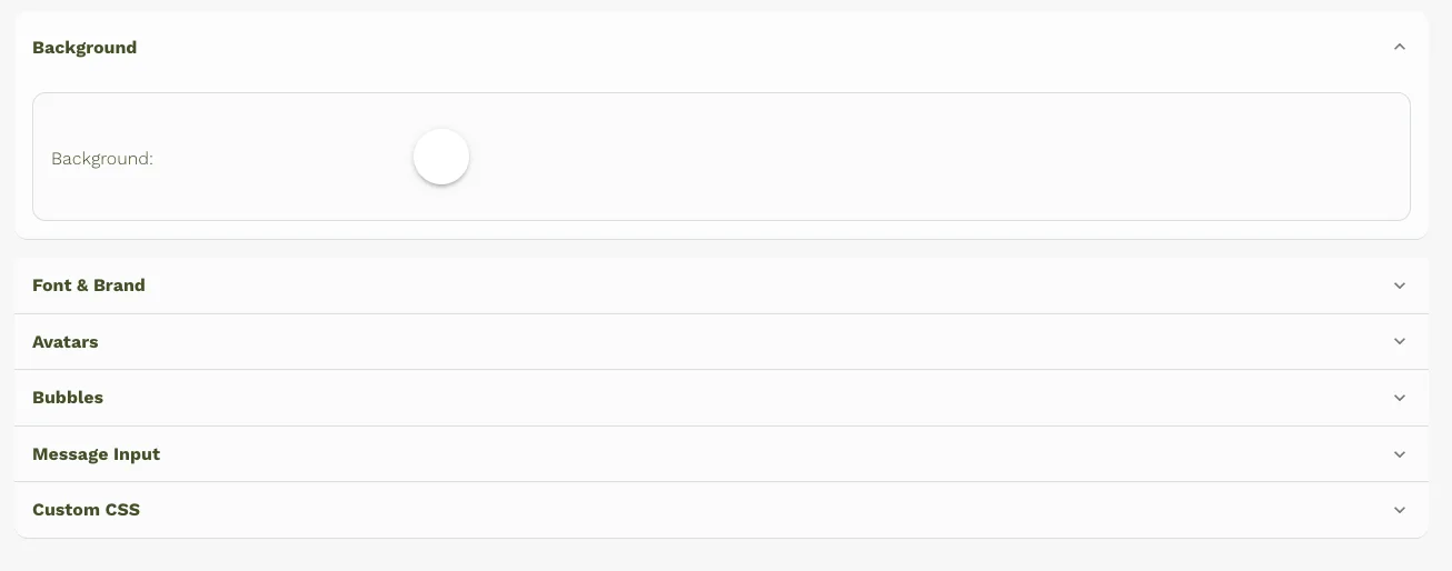
On the "Theme" Tab, you can customize the below chatbot UI elements:
Widget Background Color: Decide the chat area background first, since it touches every other element. Match it to the first fold of the landing page. If the first fold uses a neutral white background, keep the chat area white so it feels like a natural extension of the site. If the first fold leans heavily on a solid brand color, use that same color for the chat area background to stay consistent. Now in the app:
- Go to the "Background" tab.
- Select your desired color.
Font & Brand:
- Go to the "Font" tab.
- Choose your font.
Avatars:
- Prerequisite: Have an image URL ready.
- Go to the "Avatars" tab.
- Click the toggle button next to the "Avatar" label to enable customization.
- Click on the profile circle and paste the image URL.
Bubble Colors: Set AI message bubbles to the primary brand color and user bubbles to the standard CTA color from the landing page. If the chat background is white, the primary brand color usually pops well for AI bubbles. If the background already uses the primary color, switch AI bubbles to the secondary brand color from the site. User bubbles should mirror the main CTA, reinforcing that these messages are the user’s “actions.” Ensure strong contrast and accessibility: white text on dark brand colors, dark text on light ones, and sufficient contrast ratios for readability and clarity on all devices. On the app:
- Go to the "Bubbles" tab.
- Select the background color for both AI and User bubbles.
- Select the text color for both AI and User bubbles.
Input Colors and Roundness: Match the send button to the primary CTA color as well. Ensure the input field color doesn’t clash with the brand background or bubbles, keeping everything readable and cohesive. On the app:
- Go to the "Inputs" tab.
- Roundness: Use the "Roundness" dropdown to select the border radius of the input element (options: large, medium, or none). For custom border radius, use custom CSS (see below).
- Select background colors for the send button and input field.
- Select text colors for the send button, input text, and input placeholder.
For example, if your website uses navy (#001F3F) as a primary color and teal (#39CCCC) as a secondary, set:
- Chat background: navy
- Bot bubbles: teal
- User bubbles + send button: your existing CTA color
Custom CSS (Advanced Customization)
If you need more specific styling (e.g., gradients, complex styles), use custom CSS.
Steps:
- Right-click on the chatbot element you want to customize and select "Inspect" (or "Inspect Element") in your browser's developer tools.
- Identify the CSS class associated with that element. For example, the chat background might use the class
.agent-chat-view, and buttons might use.agent-button. - In the "Custom CSS" section of Predictable Dialogs, add your CSS rules to modify the element's appearance.
Example CSS:
/* Example: Chat background with gradient */
.agent-chat-view {
  border-radius: 40px;
  background-image: linear-gradient(to right, #2b3e13, #8dc26f);
  border: 1px solid grey;
}

/* Example: Button with gradient */
.agent-button {
  border-radius: 40px;
  background-image: linear-gradient(to right, #ffa500, #ff6347);
}
You can learn more about custom css by reading our documentation here.
WhatsApp Like Chatbot Tips:
- Select the "Standard" Embed type, which is a regular div.
- Add a background image in the custom css similar to WhatsApp.
- Add css border over the chatbot for the phone frame and buttons. And you will be able to get a Chatbot which looks like below:

- We offer both a theme editor for basic customization and a custom CSS option for more advanced styling.
- Use your browser's developer tools ("Inspect Element") to identify the correct CSS classes for the elements you want to modify.
- Remember to save your changes after making customizations.
If you have any questions don't hesitate to contact me.
FAQ: Personalizing Your Chatbot UI
Can I personalize a chatbot's interface to fit our brand colors?
You can personalize your chatbot’s interface to fit your brand colors. This article explains this step by step.
How to create UI for chatbot?
You can create a chatbot UI by selecting an embed type (standard, bubble, popup, or topic button), then customizing colors, fonts, shapes, and other visual elements to align with your brand.
What is the best chatbot UI design for websites?
The best chatbot UI design is intuitive, visually appealing, matches your brand identity, and includes clear elements such as chat windows, message bubbles, and user-friendly input fields.
Why is chatbot window design UI important for websites?
Effective chatbot window design enhances usability, boosts user engagement, reinforces brand identity, and improves overall user satisfaction, ultimately increasing conversions and customer loyalty.
Ready to experience a branded AI-powered chatbot on your website? Get started now.