Input Styling
Input styling controls the placement, behavior, colors, and roundness of the chat input area and send button.
Select Input Type
Before customizing input appearance, choose your input type in the Theme dashboard or via widget props.
Fixed bottom input
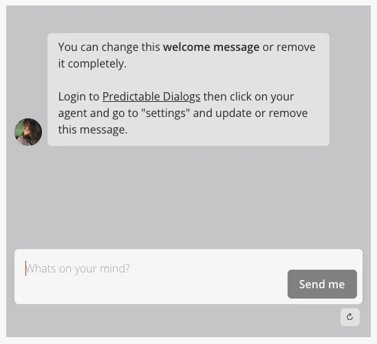
- Modern chat interface with input fixed at the bottom.
- Similar to popular messaging apps.
- Clean, streamlined appearance.
- Supports custom keyboard shortcuts for advanced users.
Floating input
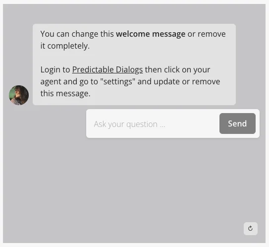
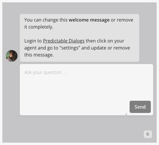
- Traditional floating input style.
- Supports single-line and multi-line options.
- More customizable positioning.
Custom keyboard shortcuts (fixed bottom only)
Custom keyboard shortcuts are available only for the fixed-bottom input type and can only be configured via widget props (not through the Theme dashboard).
You can customize which keys send messages and create new lines using the shortcuts property. This feature supports three configuration modes.
Default behavior (Enter to send)
By default, Enter sends the message and Shift+Enter creates a new line:
Agent.initStandard({
  agentName: "...",
  input: {
    type: "text input",
    options: {
      type: "fixed-bottom",
      labels: {
        placeholder: "What's on your mind?",
        button: "Send",
      },
      isLong: true,
      shortcuts: {
        preset: "enterToSend",
        imeSafe: true,
      },
    },
  },
});
Mod+Enter to send
Use Mod+Enter (Cmd+Enter on Mac, Ctrl+Enter on Windows/Linux) to send and Enter for new lines:
Agent.initStandard({
  agentName: "...",
  input: {
    type: "text input",
    options: {
      type: "fixed-bottom",
      labels: {
        placeholder: "What's on your mind?",
        button: "Send",
      },
      isLong: true,
      shortcuts: {
        preset: "modEnterToSend",
        imeSafe: true,
      },
    },
  },
});
Custom key combinations
Define your own key combinations for maximum flexibility:
Agent.initStandard({
  agentName: "...",
  input: {
    type: "text input",
    options: {
      type: "fixed-bottom",
      labels: {
        placeholder: "What's on your mind?",
        button: "Send",
      },
      isLong: true,
      shortcuts: {
        preset: "custom",
        keymap: {
          submit: [
            ["Mod", "Enter"],
            ["Shift", "Enter"],
          ],
          newline: [["Enter"]],
        },
        imeSafe: true,
      },
    },
  },
});
Key combinations:
"Enter"– Enter key alone."Mod"– Cmd key on Mac, Ctrl key on Windows/Linux."Shift"– Shift key."Alt"– Alt key.
Important notes:
imeSafe: trueis recommended to prevent conflicts with input method editors (IME) for international keyboards.- Multiple key combinations can be defined for each action.
- Only exact key matches trigger actions (no extra modifiers allowed).
- If using
"preset": "custom"without a valid keymap, the widget falls back to default behavior.
Input colors and roundness
Input styling can be customized in two ways.
Using the Theme Dashboard (recommended)
- Go to your agent in the Predictable Dialogs app.
- Open the Theme page.
- Select the Inputs tab.
- Configure:
- Roundness: Choose border radius (large, medium, or none). For fully custom radii, use custom CSS.
- Colors:
- Background color for the send button and input.
- Text color for send button, input text, and input placeholder.
Using widget props (override Theme settings)
You can also override input styling directly in your widget configuration. Below is an example using the Standard widget (the same pattern works for Bubble and Popup):
Agent.initStandard({
  // ...
  input: {
    type: "text input",
    styles: {
      roundness: "medium",
      inputs: {
        color: "#e84117",
        backgroundColor: "#f7f7f7",
        placeholderColor: "#ababab",
      },
      buttons: {
        color: "#ffffff",
        backgroundColor: "#050505",
      },
    },
    options: {
      type: "fixed-bottom",
      labels: {
        placeholder: "What's on your mind?",
        button: "Send",
      },
      isLong: false,
    },
  },
});
Note: Widget props take precedence over theme settings. For complete prop documentation, see: